Graphic Assets: Design Elements Other Than Your Logo
Visuals are an important aspect of any brand’s identity. Graphic assets — such as icons, color palettes, typography, and images — are used to create compelling visuals that align with brand guidelines.
Great graphic designers create visually appealing designs that can be used to catch an audience’s attention, communicate a message, grow brand recognition, or improve user experience (UX).
However, in order to create designs that align with the company’s brand and image, graphic designers need to have access to graphic assets.
Graphic assets are visuals that help communicate an organization’s brand and complement the organization’s logo.
Here are some examples of graphic assets your design team needs to create compelling visuals for your organization.
Need help selecting a company?
Based on your budget, timeline, and specifications we can help you build a shortlist of companies that perfectly matches your project needs. Get started by submitting your project details.
Graphic Asset Examples
- Icons
- Color Palettes
- Typography
- Images
Icons
An icon is an image that represents a specific object or action. They’re often simple, abstract shapes that clearly resemble images that viewers are familiar with.
Images, such as icons, help viewers quickly identify important information and understand your message. In fact, people process visuals 60,000 times faster than text, making symbols and iconography important tools for communicating with your audience.
When included in a web design or software system, icons can also improve end-user experience. They’re often interactive and can help users access menu items.
For example, Gmail uses icons to represent actions users can take to organize their inboxes. This menu shows what icons they’ve created to move an email to a junk folder, mark as unread, or flag.
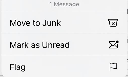
Source: Gmail
On top of that, these icons are the same no matter which platform you use to access your email — a web browser, mobile browser, or app. By creating a consistent user interface, they’re able to streamline the user’s workflow.
Color Palettes
As an important aspect of your brand identity, color can be used to pull together all of your design elements and create a harmonious look and feel for your brand assets.
Additionally, establishing a clear color scheme for your business can grow brand recognition, improve UX, and increase sales.
For new businesses that haven’t established their brand guidelines yet, choosing a color scheme can be tricky. To create the perfect color palette for your brand you should:
- Research what colors mean and how people respond to them.
- Identify your brand’s characteristics to ensure your color scheme reflects your brand.
- Look at your competitor’s colors to make sure that your brand stands out.
- Consider what colors are trending.
- Choose colors that compliment one another.
By working with your brand’s color scheme, your graphic design company can help you create a consistent look across all of your platforms, ads, and marketing materials.
Typography
Typography is how designers arrange letters and text in order to create eye-catching content. By adjusting the font, size, color, spacing, and alignment of each letter, they’re able to:
- create a visual hierarchy
- grab their audience’s attention
- deliver their messages more effectively
On top of that, the artistic elements associated with typography can help companies convey their brand more effectively. Whether you’re trying to convey a professional image, or are trying to look like a more fun brand, the fonts and colors you use impact how your brand is perceived.
Studies have shown that fonts have emotions and personalities associated with them. So if you’re trying to portray a formal, mature, or assertive tone, sans serif fonts, such as these are your best bet:
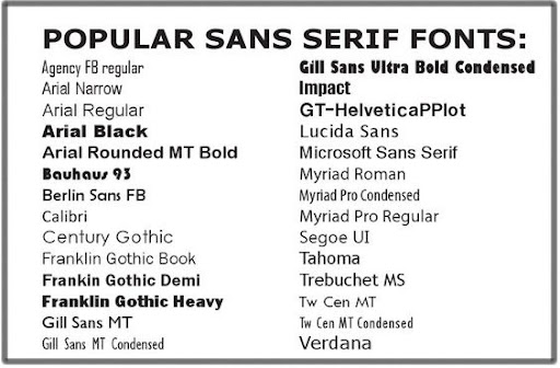
Source: Pinterest
Script fonts, on the other hand, are considered more whimsical and therefore, are better for more creative or casual brands. For example, Vimeo uses an experimental font similar to the Black Rose font.

Source: Vimeo
As a video hosting, sharing, and services platform, Vimeo wanted to convey a creative brand image. This font helps them showcase what their platform is really about — creativity.
Images
Images, such as photographs, can attract viewers and help them draw connections between text and their primary message. The same can be said for illustrations and graphics — both can be used to demonstrate a general idea or add decoration to a design.
They can also help organizations emphasize their brand identity by generating an emotional response from viewers.
Consider how a photographer can edit their images to create a light and airy look or dark and moody — while both are appealing, graphic designers can help you determine which theme helps you convey your brand identity more effectively.
This chart shows how editing impacts how an image looks and feels:
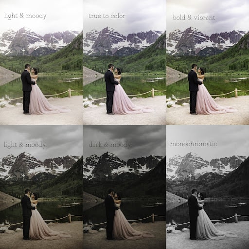
Source: Mallory Williams
They’re all the same image, but they each evoke a different emotion because they are edited differently.
However, once you choose a style, you need to stick to it; there must be consistency across all of your assets in order to create a cohesive look.
Graphic Assets Help All Aspects of Business
Good graphic design companies work with branding and marketing teams to create graphic assets that accurately reflect the company’s brand and convey their message.
Visual design elements such as icons, color palettes, typography, and images, all work together to create cohesive look and feel.
Together, they will emphasize your brand identity, catch your audience’s attention, and improve user experience.
Need help selecting a company?
Based on your budget, timeline, and specifications we can help you build a shortlist of companies that perfectly matches your project needs. Get started by submitting your project details.